

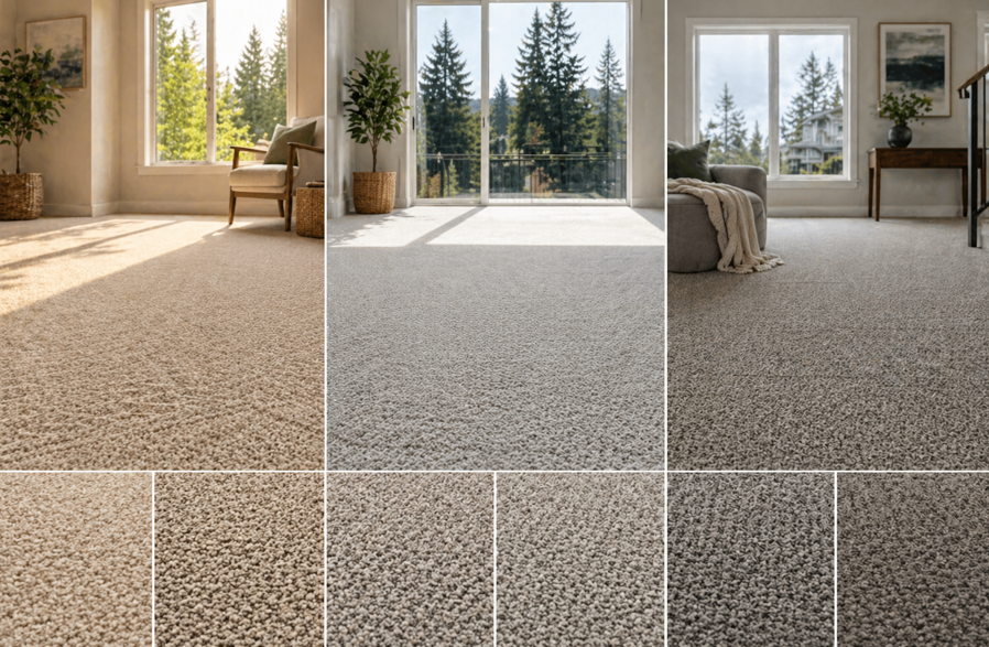
Why Natural Light Plays a Bigger Role Than You Think
When homeowners think about choosing carpet, colour is often one of the first decisions—but it’s rarely considered in relation to natural light. In places like Redmond and surrounding areas, where daylight can shift dramatically throughout the year, lighting has a direct impact on how your carpet looks and feels in your space.
Natural light isn’t constant. Overcast skies, long winter months, and bright summer days all affect how colours appear. A carpet that looks warm and inviting in a showroom might feel completely different once it’s installed in your home.
This is why choosing carpet colour isn’t just about personal preference—it’s about how that colour interacts with your environment. Light can make colours appear lighter, darker, warmer, or cooler depending on the time of day and the direction your windows face.
At Eastside Carpets & Floors, homeowners often discover that the right carpet colour can completely transform a room. It can make a space feel brighter, more open, or more grounded—all depending on how it works with the natural light available.
Understanding this relationship helps you make a choice that feels right not just today, but every day throughout the year.
Understanding How Natural Light Affects Carpet Color
Before choosing a colour, it helps to understand how light behaves in your home.
Direction of Light
The direction your windows face plays a major role in how light enters your space:
North-facing rooms tend to have cooler, softer light
South-facing rooms receive warm, consistent sunlight
East-facing rooms get bright morning light
West-facing rooms experience stronger afternoon light
Each of these lighting conditions changes how carpet colours appear throughout the day.
Intensity of Light
Rooms with large windows or open layouts will naturally feel brighter. In these spaces, lighter carpet colours may appear even more vibrant, while darker tones can create contrast and depth.
In rooms with limited natural light, colours may appear more muted or subdued.
Seasonal Changes
In the Pacific Northwest, seasonal shifts matter. Winter brings softer, diffused light, while summer introduces brighter, more direct sunlight. A carpet colour needs to work well in both conditions.
By understanding these factors, you can choose a colour that feels balanced and consistent year-round.
Best Carpet Colors for Bright, Sun-Filled Rooms
Rooms with plenty of natural light offer flexibility, but they also require thoughtful choices to avoid overwhelming the space.
Neutral Tones
Soft beiges, warm greys, and taupes work beautifully in bright rooms. They reflect light without feeling too intense and create a balanced, welcoming atmosphere.
Medium Shades
Mid-tone colours add depth without making the room feel heavy. They help ground the space while still allowing natural light to shine.
Subtle Patterns
In sun-filled areas, subtle patterns can add visual interest without dominating the room. They also help disguise minor wear over time.
What to Keep in Mind
Avoid overly bright whites, which can feel stark in strong sunlight
Be cautious with very dark colours, as they can create high contrast
Bright rooms give you more options, but the goal is to create harmony rather than competition with natural light.
Choosing Carpet Colors for Low-Light Spaces
Rooms with limited natural light require a different approach. The goal here is to enhance brightness and create a sense of openness.
Light Neutrals
Soft creams, light greys, and pale beiges help reflect available light, making the room feel larger and more inviting.
Warm Undertones
Colours with warm undertones can counteract the cooler light often found in north-facing rooms. This helps create a more comfortable and balanced feel.
Consistent Colour Flow
Using similar tones throughout connected spaces can make smaller or darker rooms feel more cohesive.
What to Avoid
Very dark colours that absorb light
Cool tones that may make the space feel colder
With the right colour, even a dim room can feel bright and welcoming.
How Carpet Color Influences Room Size and Mood
Carpet colour doesn’t just affect appearance—it also changes how a space feels.
Lighter Colors
Make rooms feel larger and more open
Reflect natural light effectively
Create a calm, airy atmosphere
Darker Colors
Add warmth and coziness
Define spaces within open layouts
Hide dirt and wear more effectively
Mid-Tones
Offer a balance between light and dark
Work well in most lighting conditions
Provide flexibility for changing décor
Choosing the right colour means thinking about how you want the room to feel as much as how you want it to look.
Matching Carpet Colors with Your Home’s Design Style
Your carpet should complement the overall design of your home, not compete with it.
Modern Interiors
Neutral tones like grey, beige, and soft charcoal create a clean, contemporary look.
Traditional Spaces
Warmer tones such as taupe or soft brown add richness and depth.
Minimalist Designs
Light, understated colours keep the space simple and uncluttered.
Family Homes
Practical colours that balance style and durability are ideal for active households.
Exploring different carpet flooring options helps you find a style that aligns with both your design vision and your everyday needs.
Common Mistakes to Avoid When Choosing Carpet Color
Even with the best intentions, it’s easy to make choices that don’t work as expected.
Choosing Based on Samples Alone
Small samples don’t always show how a colour will look across an entire room. Lighting can change dramatically once the carpet is installed.
Ignoring Lighting Conditions
A colour that looks perfect in one room may feel completely different in another.
Following Trends Too Closely
Trendy colours may not always suit your space or stand the test of time.
Overlooking Practical Needs
Appearance matters, but so does durability and ease of maintenance.
Taking a step back and considering the full picture helps you avoid these common pitfalls.
Tips for Testing Carpet Colors in Your Home
Before making a final decision, it’s worth taking a little extra time to test your options.
View Samples in Different Lighting
Look at carpet samples at different times of day to see how the colour changes.
Place Samples in Key Areas
Test colours in the rooms where they’ll be installed to get a realistic sense of how they’ll look.
Compare Multiple Options
Seeing colours side by side helps you identify subtle differences.
Think Long-Term
Choose a colour that will continue to feel right as your space evolves.
These simple steps can make a big difference in your final decision.
Choosing Carpet That Fits Your Lifestyle
While colour is important, it’s just one part of the bigger picture.
Think about:
How much foot traffic each room gets
Whether you have pets or children
How often you entertain guests
Your long-term design goals
Balancing these factors ensures your carpet not only looks great but also performs well over time.
Create a Space That Feels Right in Every Light
Choosing the right carpet colour is about more than aesthetics—it’s about creating a space that feels comfortable and consistent throughout the day and across seasons.
In Redmond homes, where natural light can shift dramatically, the right choice makes all the difference. It enhances your space, supports your lifestyle, and helps your home feel complete.
At Eastside Carpets & Floors, the focus is on helping homeowners find flooring that works beautifully in real-life conditions. With expert guidance and a wide range of options, the process becomes clear and enjoyable.
If you’re ready to explore carpet options that complement your home’s lighting and design, you can always reach out to us to get started.


