
A beautiful floor can make a kitchen or open-plan living area feel finished, but the wrong floor tone can make even high-quality cabinetry look slightly off. That is why matching luxury vinyl plank (LVP) with cabinets is less about finding two colors that look “close” and more about understanding undertones, contrast, lighting, and the overall mood you want the room to have.
For Bellevue homeowners, lighting deserves extra attention. The city has a classic Pacific Northwest maritime climate, with significant rainfall and substantially more cloud cover through much of fall and winter. That means a flooring sample that looks warm and balanced under bright showroom lighting may read cooler, darker, or flatter in your actual kitchen on an overcast afternoon.
At Eastside Carpets & Floors, homeowners can compare flooring samples in the spaces where they will actually be installed. That is especially useful when cabinetry is already in place because you can evaluate floor tones against the cabinet finish, countertops, wall color, and natural light at the same time. The company’s mobile showroom is specifically designed to let homeowners see flooring samples under their own lighting and beside their existing décor.
The goal is not to create a perfectly matched room. In fact, a little contrast usually creates a more intentional look. The real objective is to make sure the flooring and cabinetry feel related, balanced, and comfortable together.
Start With Undertones, Not Just Surface Color
Two floors can both be described as “brown,” yet one may lean golden or red while the other has gray, taupe, or even slightly green undertones. Cabinets work the same way. Once you start seeing the undertone beneath the surface color, coordinating the room becomes much easier.
How to Spot Warm Undertones
Warm wood tones often show hints of:
Honey
Gold
Amber
Red
Orange
Caramel
Cabinets in oak, cherry, maple, walnut, and many stained wood finishes often fall into this category, although the exact undertone depends on the stain.
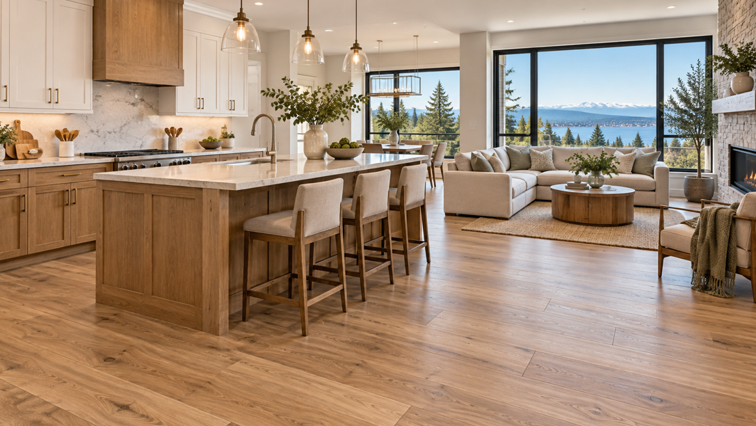
Warm-toned LVP can complement these cabinets beautifully when the flooring is related but not identical. For example, medium oak cabinets with golden undertones can pair well with a lighter natural-oak floor that carries a soft beige or warm tan base.
How to Spot Cool Undertones
Cooler tones often show hints of:
Gray
Ash
Blue
Charcoal
Greige
Muted brown
Cool-toned cabinetry may include painted gray, blue-gray, charcoal, or some contemporary stained wood finishes. Floors with ash, gray-brown, or muted greige undertones can support these cabinets without introducing a competing warmth.
Neutral Undertones Give You More Flexibility
Some LVP styles sit between warm and cool. These balanced beige, taupe, and natural oak tones are useful when a room contains several finishes that need to work together.
Modern LVP collections offer increasingly nuanced finishes rather than simple flat brown or gray. Current products include combinations of warm brown, gray, beige, and other layered undertones, giving homeowners more flexibility when cabinetry, counters, and furnishings do not all fall into one color-temperature family.
Match White Cabinets With Intention
White cabinets may seem easy to pair with flooring, but the result depends on what kind of white you have and how much contrast you want.
White-on-white can look clean, but a very pale floor beside bright white cabinets may make a room feel washed out if there is not enough texture or contrast. On the other hand, going very dark can create a dramatic look that feels heavier than expected in a smaller kitchen.
Warm White Cabinets
Creamy or warm white cabinets often pair well with:
Natural oak
Honey-beige LVP
Light walnut looks
Warm greige
Soft medium-brown planks
These combinations keep the room comfortable and inviting. They also work well with brass, champagne bronze, or other warm metal hardware.
Cool or Crisp White Cabinets
Crisp white cabinetry gives you more freedom to use cool-neutral or balanced wood looks. Consider:
Pale ash
Neutral oak
Mushroom brown
Soft greige
Medium natural wood tones
A mid-tone floor can be particularly effective because it grounds a bright kitchen without making it feel dark.
If your counters have strong veining, use the countertop as a bridge. A floor does not need to repeat the exact cabinet color. It can instead pick up a secondary beige, taupe, or gray tone from the countertop so the entire palette feels connected.
Designers often coordinate permanent surfaces as a complete palette rather than treating cabinets, counters, and flooring as unrelated choices. Using one finish to visually connect two others can create a more cohesive room.
Pair Natural Wood Cabinets Without Making the Room Too Wood Heavy
Wood cabinets with wood-look flooring can create a beautiful, layered interior, but matching the species and stain too closely can make the room feel flat.
The better approach is usually coordination rather than duplication.
Light Oak Cabinets
Light oak cabinets often look best with flooring that creates gentle separation. You might pair them with:
Slightly darker natural oak LVP
Warm taupe
Soft brown
Muted greige
Beige-based wood looks
Avoid choosing a plank that is nearly identical in grain, shade, and undertone unless you are deliberately creating a very uniform Scandinavian-style interior.
Medium Brown Cabinets
Medium walnut, maple, and stained oak cabinetry gives you several directions. A lighter floor can open the room visually, while a deeper floor can create a richer, more traditional mood.
For many Bellevue homes, a light-to-medium floor is a versatile choice because it can help keep interiors feeling brighter during cloudier months while still creating enough contrast against the cabinetry.
Dark Wood Cabinets
Espresso, dark walnut, and deep brown cabinetry can look striking with lighter flooring. Pale oak, neutral beige, and light greige floors often create a more balanced room and help the cabinetry stand out.
Dark flooring with dark cabinets can work in a large space with generous natural light, but it creates a much heavier visual effect. If you love that look, lighter counters, backsplash materials, walls, or furnishings can provide balance.
When comparing luxury vinyl flooring, look at full planks rather than relying only on a small sample. Wood-look LVP can include meaningful variation from plank to plank, and that variation affects how the entire room reads.
Coordinate With Gray, Blue, Green, and Painted Cabinets
Painted cabinetry can become a strong design feature in kitchens, bathrooms, built-ins, and laundry rooms. LVP works particularly well with painted cabinets because wood-look planks add warmth and texture without requiring the cabinetry itself to resemble natural wood.
Gray Cabinets
Gray cabinetry can lean warm or cool, so identify that undertone first.
Warm gray or greige cabinets pair naturally with beige oak, taupe, and muted brown floors. Cooler gray cabinets may work better with ash, neutral oak, or gray-brown flooring.
One common design mismatch is combining a very cool gray cabinet with an intensely yellow floor. The two surfaces can make each other look stronger and less natural. A balanced neutral between them usually creates a smoother transition.
Blue Cabinets
Navy and dusty blue cabinets can look sophisticated with warm natural wood tones. Medium oak, light walnut, and beige-based LVP bring warmth into the palette and prevent blue cabinetry from feeling overly cool.
If the blue is already muted or gray-based, a neutral floor can create a quieter, contemporary look.
Green Cabinets
Sage, olive, and forest green cabinetry often works beautifully with nature-inspired flooring. Natural oak, warm walnut, beige-brown, and lightly weathered wood looks can reinforce an organic palette.
The intensity of the cabinet color matters. A strong forest green may benefit from a calmer floor with limited color variation, while a soft sage cabinet can comfortably sit alongside slightly more grain and movement.
Black or Charcoal Cabinets
Very dark painted cabinets create strong visual weight. Lighter LVP usually provides the easiest balance. Natural oak, pale brown, beige, and subtle greige can keep the room feeling open while allowing the cabinetry to remain the focal point.
Use Contrast to Create a More Designed Look
Matching does not mean making every surface the same color. Some of the strongest interiors use clear contrast between cabinets and floors.
Contrast helps define each element. Light cabinets over a medium or dark floor feel crisp and grounded. Dark cabinets over a light floor feel bold without overwhelming the room.
Think in Three Levels: Light, Medium, and Dark
A simple way to evaluate a room is to divide major finishes into three value levels:
Light
Medium
Dark
If your cabinets are light, consider a medium floor. If your cabinets are dark, try a light or medium floor. If your cabinetry is medium in value, you have more flexibility, but the countertop and wall color can help determine the best direction.
You do not need one finish from every category. The idea is simply to avoid accidental sameness.
Let One Feature Take the Lead
If your cabinets have dramatic grain, rich color, or a bold painted finish, allow the flooring to play a quieter supporting role. Choose an LVP with controlled movement and a more restrained tone.
If your cabinets are simple and neutral, you can let the flooring carry more character through wider visual variation, knots, mineral streaks, or a more expressive wood pattern.
This keeps the room from becoming visually busy. It also gives the eye a clear focal point instead of making the cabinets, flooring, counters, and backsplash compete equally for attention.
Consider Bellevue’s Natural Light Before Making a Final Choice
Flooring color changes throughout the day. That is true everywhere, but it is particularly relevant in Bellevue because fall and winter bring considerable cloud cover and rainfall. Bellevue’s 2025 hazard mitigation plan reports that most precipitation occurs during the fall-winter period, with cloud cover rising considerably during those months.
North-Facing Rooms
North-facing spaces often receive cooler, softer light. Very gray flooring can look even cooler here, especially beside crisp white or blue-gray cabinetry.
A warm-neutral floor can help offset that effect without looking strongly yellow.
South- and West-Facing Rooms
These rooms can receive stronger afternoon light, which may make warm flooring appear more golden. A neutral or slightly muted LVP can keep the palette balanced if the cabinets are already warm.
Rooms With Limited Windows
In a darker kitchen or interior room, lighter or medium LVP generally creates a brighter visual impression than deep espresso or charcoal styles. That does not mean dark flooring is off-limits, but it makes viewing samples in the room particularly valuable.
Eastside Carpets & Floors offers a mobile showroom, which is useful for this exact reason: flooring can be viewed beside your actual cabinetry and under your home’s real lighting instead of being judged only under showroom fixtures.
Bring Countertops, Backsplashes, and Hardware Into the Decision
Cabinetry may be the largest vertical feature in the room, but it is not the only finish the floor has to coordinate with.
Countertops Can Bridge Two Tones
A countertop with warm and cool movement can connect cabinets and flooring that are not identical in undertone. For example, a quartz surface with white, beige, and soft gray veining can bridge white cabinets and a warm greige LVP.
If the countertop is highly patterned, consider quieter flooring. If the countertop is simple, the floor can carry more visual texture.
Backsplashes Affect the Overall Temperature
A warm cream backsplash can make gray cabinets look cooler. A bright white backsplash can make beige flooring look warmer by comparison. Look at all three surfaces together instead of choosing the floor in isolation.
The goal is not to make every finish match. You are looking for enough shared color or contrast that the surfaces appear intentional beside one another.
Hardware Adds a Small but Important Signal
Hardware is not large enough to determine the flooring color, but it can reinforce the room’s direction.
Brass and bronze often support warm palettes. Black hardware works across warm, neutral, and cool schemes. Brushed nickel and chrome can emphasize a cooler, cleaner look.
The strongest rooms usually repeat related tones in several places. A warm oak floor might connect visually with brass hardware, a wood accent shelf, and subtle beige movement in the countertop without becoming overly coordinated.
Test LVP Samples the Way You Will Actually Live With Them
Small samples are useful for narrowing choices, but they do not tell the full story.
Start by placing the sample directly against the cabinet toe kick or lower cabinet face. Then move it several feet away and look at the relationship from across the room. Flooring covers a large surface, so distance matters.
Check Morning, Afternoon, and Evening Light
View samples at different times of day. Artificial lighting can also change the appearance of both cabinets and flooring, so turn on the lights you normally use at night.
A plank that looks neutral in morning daylight may feel warmer under evening bulbs. Comparing it more than once reduces the chance of choosing a floor based on one lighting condition.
Compare Multiple Planks
If possible, look at several planks together. Realistic LVP often includes color and pattern variation designed to resemble natural wood. One plank may be lighter, darker, or more strongly grained than another.
Manufacturers currently offer wood-look LVP with deliberate mineral lines, splits, tonal variation, and textured grain details, making it important to judge the overall pattern rather than a single small section.
Look Beyond Color
Also compare:
Grain scale
Plank width
Surface texture
Matte versus glossier finishes
Edge detail
Overall pattern variation
A color may coordinate perfectly, yet an extremely rustic plank can still feel out of place beside sleek, flat-panel cabinetry. Likewise, a highly uniform floor may feel too restrained beside traditional, detailed cabinets.
Keep Permanent Finishes in Mind
Cabinetry and flooring are both major investments. Trend-driven accessories are easier to replace, while permanent finishes tend to stay in place much longer.
A versatile floor tone can give you more freedom to update wall paint, stools, lighting, rugs, furniture, and décor later without needing to redesign the entire room.
Create a Cabinet-and-LVP Combination That Feels Right at Home
Matching LVP with cabinetry is less about following a rigid color rule and more about building a room where every finish feels intentional.
Start with undertones. Decide how much contrast you want. Bring the countertop and backsplash into the conversation. Then test full flooring samples in the actual space and observe them under Bellevue’s changing natural light.
For white cabinetry, natural oak, beige, greige, and medium wood tones offer plenty of flexibility. For natural wood cabinets, avoid copying the exact cabinet finish and create some separation instead. Painted gray, blue, green, and black cabinets often look strongest when the floor provides balance rather than competing for attention.
Most importantly, choose a combination that works with the whole home, not just one cabinet door. Open floor plans make flooring visible from several rooms, so the right LVP can help connect kitchens, dining areas, hallways, and living spaces into one cohesive design.
Eastside Carpets & Floors brings more than 30 years of flooring experience to homeowners throughout Redmond, Bellevue, Kirkland, Bothell, Woodinville, Sammamish, and Issaquah. With a Redmond showroom, professional installation, free in-home estimates, and a mobile showroom, you can compare tones in the setting where they matter most.
If you are narrowing down cabinet and flooring combinations for a remodel, get in touch to schedule a consultation and explore LVP options that complement your home’s cabinetry, lighting, and overall style.


